HOUZZ, if you aren't familiar with the site, is a website and online community devoted to architecture and interior design. It is a massive source of reference material one can use to find solutions to problems, inspiration for remodels and designs, and ideas for things that you had no intention of doing anyway. The downside is it is almost a bottomless pit of distractions. Once you feel settled on an idea HOUZZ comes along and offers one more thing you didn't consider.
I could devote endless posts on how HOUZZ has provided insight, and turmoil, to our process but I'll focus here on paint color. Since our design is modern by most standards we new that traditional neutral colors (like beige) with darker trim would no work for us. We definitely wanted a color that conveyed simplicity, and clean lines.
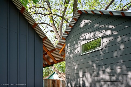
But the more homes we saw in this color we noticed blue tints and we didn't feel it was a good fit. The color Iron Ore grabbed our attention because it fell more towards the gray side. Here it is on the horizontal plank (below, with Hardie panel adjacent!). But our home has a large front elevation and having a giant slab of gray seemed like it would be a bit depressing. So we have decided to use the Iron Ore on the front bump-outs, and possibly the rear bumps.
Next we pointed our browser to HOUZZ and began studying White as an option. And we then learned that White is a tough, take-no-prisoners, color. Who knew there were hundreds of shades of white! There are endless article available guiding you on the nuances of white which were helpful, but in the end we just looked at every picture we could find of white houses. When the house color wasn't listed we sent an email inquiring for paint details. Thanks goodness for this internet thing when it comes to these matters because our experience in brick & mortar paint stores has not been good when it comes to guideance on color selection. The internet, on the other hand, is trodden with people with experience - the good, the bad, and ugly. We read cautionary tales of endless repaints, tips on sampling and matching, and other general paint advice. But in the end you've got to make the choice on your own.
A long story short: we have decided to use Eider White by Sherwin Williams for the majority of the house. We were looking for a white that was not blindingly bright like fresh snow on a sunny day, and we did not want a creamy tint either. Here were some homes we found that seemed to have the right vibe:

 |
| We like the clean simplicity of white paint. |

And like each of these examples we will paint all of the trim in Eider White, too. We have more adventurous plans for the entry door color and I'll detail that in another post. Thanks for reading.


No comments:
Post a Comment